By Robin Garr
LouisvilleHotBytes.com
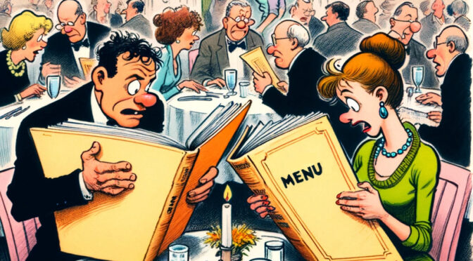
Menus: Can’t live with ‘em. Can’t live without ‘em! You step into a restaurant, take your seat, and pick up the menu. How does this make you feel? Joy at anticipating a tasty meal, or fear that something is about to make you crabby?
Why must menus disappoint us in so many ways, from look and feel to organization and design to the way they communicate? The menu has just one job, and sadly, it doesn’t always get that job done.
Where do menus go wrong? Let us count the ways.
Too hard to see
Pale gray type on a light green background? It’s arty, but it isn’t cool. When your menu designers double down by printing that hundred shades of gray in six-point type, it almost feels as if they’re trying to punk us.
”I’m old,” one friend said. ”I need to be able to read the font size.” Another friend agreed: ”I also like print that is visible without a magnifying glass.”
Romantically dim lighting just makes matters worse. ”I want a menu that I can read without having to get my phone light out,” one friend griped, recalling a Hoosier eatery that used tan text on cream paper. ”It was probably fine in bright light to a 20-something,” they said, ”but not terribly legible in a dimly lit dining room to a 50-something’s eyes.”
Don’t touch that menu!
During the pandemic, a lot of places began using a QR code, that digital labyrinth of mysterious data squares, to whisk us to an online menu with our own smartphone.
”If this is your only menu, I’m out of here,” said one. ”I know I sound like an old lady,” another friend said, :but I hate QR menus. My 18-year-old daughter said it’s definitely not an old lady thing. She hates them too.”
Why the hate? One friend explained: ”I don’t go into a restaurant to get more screen time. I want to escape all the things I use my phone for, whether it’s work, personal business, keeping up with all the kids’ school stuff that only comes via email now. Our entire lives are on our phones. Can’t we get a small reprieve?!”
Another friend put it simply: ”A proper menu is part of the dining experience. QR codes are not.”
Okay, that makes sense to me.
What’s more
Other menu preferences go back to the pandemic, and to ongoing concerns about germs and cooties. I feel for restaurant managers, because not everyone is on the same menu page. Some like single-use paper menus that no one else has shared. Others find that too casual and want something solid, maybe even presented in leather-look covers.
I could only shake my head, befuddled, when one friend demanded laminated menu pages because they’re easy to wipe clean, while another pal doesn’t even want to touch a laminated page because yuk. You can’t please everyone, but if you’re in business serving the public, you really wish you could.
Finally, clearly note allergens and whether a dish is vegan or vegetarian. If a dish is spicy hot, say so! These things matter to people. Oh, yeah, and list your prices, for cripes’ sake!
So many choices!
”Not too many items,” one friend requested, ”It makes it hard to make up my mind if there is too much.” Others agreed. ”Restaurants should have a few items they specialize in, but don’t overcomplicate it,” added another. ”I don’t want to have to browse through 10 pages of menu.”
I agree, kind of. I like variety and I like choice. In my recent visit to Sankalp Indian, for instance, I was stunned at first by its wealth of maybe 200 choices. I love Indian food, so ultimately it made me happy. But I’m glad I thought to look at the online menu at home first, so I could narrow my choices.
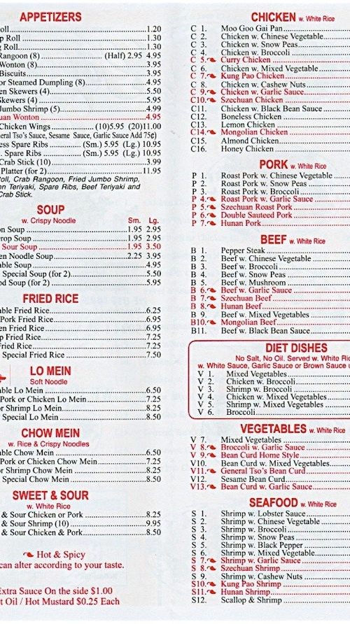
What’s more, tradition matters. If I go to a quick-service style Mexican, Indian, or Chinese restaurant, I’m not surprised by a menu with more than 100 choices. I realize that they can accomplish this by having a relative few vegetable and protein choices, largely prepped and ready along with several sauces, noodles, and a giant vat of rice. Just about any of those 100 options can be quickly assembled, tossed into a screaming-hot wok, stir-fried, boxed, and rushed out to the hungry customer.
That works in those settings, but it’s less doable at your fancy dining room or trendy bistro where one expects a bit more personal attention to the dinner plate.
What’s in my dish?
Everyone wants a descriptive menu, but there’s a lot of debate over what that looks like. Don’t be snobby? ”Any mention of ‘dusting’ or ‘hints’ or ‘shadows’ or ‘nuances’ or elite genetic heritage of anything pisses me right off,” said one. ”No information. A menu should include basic description of the dish with the key ingredients,” suggested another.
I hold up the menu at Meesh Meesh in Nulu, one of my favorite new restaurants of 2023, as meeting a lot of my needs: At the time of my visit, it was short but not too short, with five main dishes, a trio or larger plates, and a variety of sides. Ingredients and descriptions were good, not great: ”Amba, jalapeño schug, and herbs” gives us a hint, but only if we know what schug and amba are.
And so …
With a little help from my friends, I could go on and on. Maybe another day I will. Today, though, let’s just leave this word of wisdom to the good folks who run restaurants and plan the bill of fare: Communication is the key. If people can read your menu, understand it, and take away what they wan’t for dinner and why, you’ve done your job. If not, you’ve got a problem, right here in River City, and it starts with M and that stands for menu.
